Brand
The CogniLead logo.
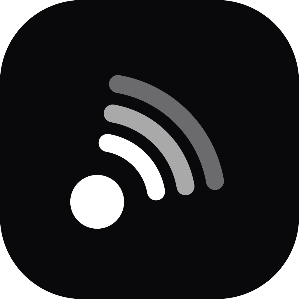
The mark is Corner Sweep: a live send — the filled hub — radiating a warm-up signal that fades as it travels. It is a picture of what the product does, which is why the arcs step down in weight rather than sitting at one. Everything here is free to use when you write about or link to CogniLead.
12 assets · SVG and PNG · vector is canonical








Variations
Every version of the logo
Pick the one that fits the ground you are putting it on. The gradient is for light, unsaturated grounds; anything darker or busier takes the reversed version.
Logo, one colour
Single-colour reproduction: print, engraving, a fax of a contract.




Stacked logo
Square spaces: a badge, a slide corner, a sponsor board.

Stacked logo, reversed
The same, on a dark ground.

Mark
The glyph alone, where the name is already present. Light grounds.




Mark, reversed
The glyph alone on a dark or saturated ground.




Mark, one colour
The glyph alone, single colour.




Wordmark
Only when the mark already appears nearby — a partner page, a row of names.



Wordmark, reversed
Same rule, on a dark ground.



App icon
White glyph on the gradient tile — the favicon and touch-icon form. Use this when CogniLead needs to read as an app, in a directory or an integrations grid.




App icon, dark
Ink tile, for dark app grids and avatars.



Construction
One centre, three radii
The mark is struck from a single point. The hub is a filled circle of radius 3.6; the three arcs share that exact centre at radius 8, 12 and 16, each on a 2.4-unit round-capped stroke, stepping down through 100%, 65% and 40% opacity. All of it inside a 40-unit box.
In motion the signal leaves the hub and fades — the arcs light outwards, then rest. The hub never moves: the send is the fixed thing.
Minimum size
Below 16 px the outer arc closes up and the signal stops reading. The logo needs 103 px for the same reason — it is 6.4× as wide as it is tall. Tighter than that, drop the wordmark and use the mark alone.
Clear space
Keep empty space around the logo at least half the height of the mark, on all four sides. Nothing goes inside the hatched area — not text, not another logo, not the edge of a photograph.
Colour
One gradient, three stops
Running on the diagonal, anchored on the brand orange. These are the only values the mark is ever drawn in — plus ink, for single-colour work.
Accent
#d93900
The brand primary. The gradient starts here, and it is the hub of the mark.
Accent neon
#f4511e
The gradient's midpoint, and the hover/glow accent in the product.
Amber
#f59e0b
The gradient's far end — where the warming signal fades out.
Ink
#09090b
Body text, and the one-colour logo.
Typeface
Plus Jakarta Sans
The wordmark is Plus Jakarta Sans Bold, outlined — the downloadable files carry real vector paths, so they need no font installed. The product and the rest of the site are set in Inter. Both are free and open-source.
Usage
Please don’t
Use the files as they are. Redraw, recolour or re-space the mark and it stops being our logo, which defeats the point of using it.
The name
Write CogniLead: one word, two capitals. Not Cognilead, not Cogni Lead, not COGNILEAD. The name and the mark are CogniLead trademarks.
You may use these files to refer to CogniLead — an article, a talk, an integrations directory, a comparison page, or to show that your product connects to ours. You may not use the mark as your own product icon, put it in your logo, or arrange it so it implies CogniLead built or endorsed something it did not.
Questions
Need another size or format, or planning something the rules above don’t cover — co-marketing, a physical print run, a case study? Email brand@cognilead.ai.
The wordmark is outlined from Plus Jakarta Sans (SIL Open Font License 1.1).